Discipline
Marketing Campaign
AD & Design
Matej Ferlič
CD & Copy
Juš Šoltes
Giving a hand to children in distress
ZPMS Campaign 2025
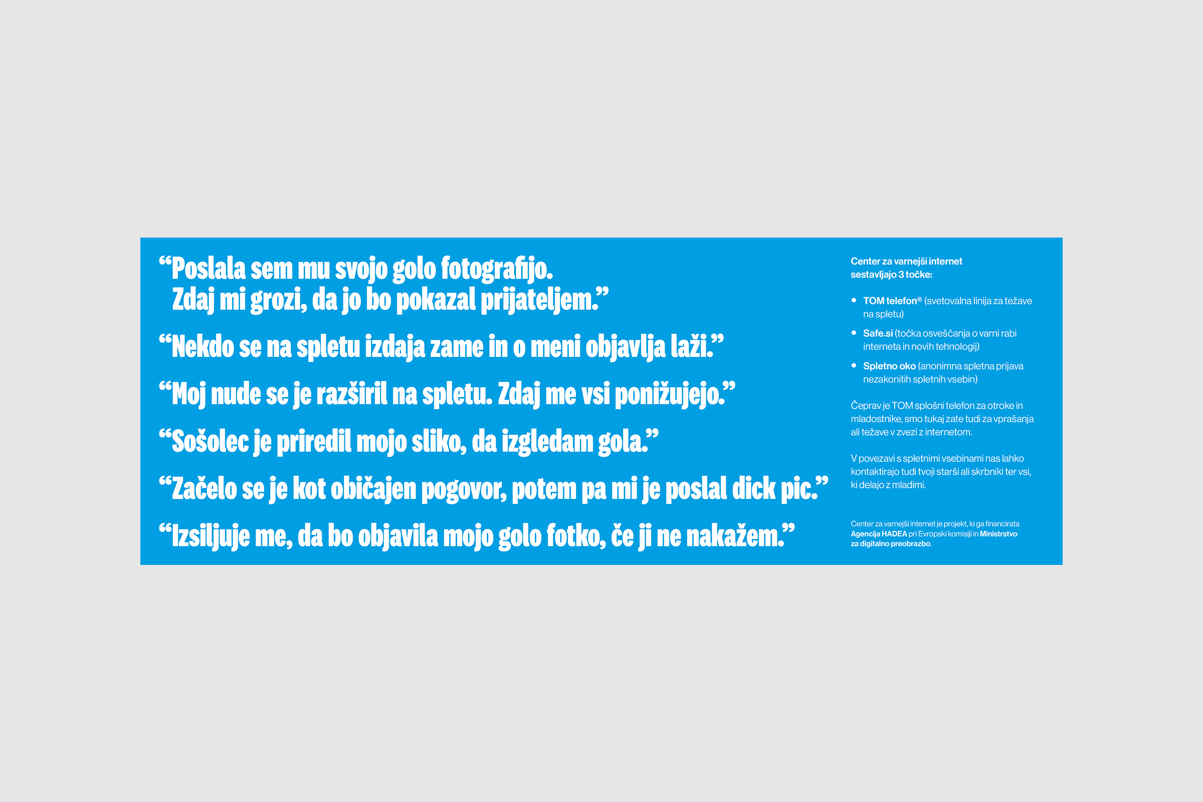
The project was commissioned by ZPMS (Zveza Prijateljev Mladine Slovenije), who approached us with the challenge of creating a unified communication campaign divided into two parts: the first focused on promoting the TOM helpline, and the second on raising awareness about the dangers and consequences of sextortion among young people. Both parts had to be connected through a shared visual identity and a clear call to action: to reach out to TOM when in need of help. The key difficulty lay in addressing children and teenagers who are at a transitional age: developing, asserting independence, and striving to appear “grown-up.” The message had to be serious and trustworthy enough to gain their respect, yet still warm, friendly, and relatable. The campaign needed to inform about TOM’s anonymous, confidential, and free support, while also warning about the increasing threat of sextortion without using fear or shame as tools.
The foundation of the campaign was built on tone and trust. We set out to create communication that would feel like a conversation with a friend, not a lecture from an adult. Our goal was to meet the children and teenagers where they already are — in schools, online, and on social media —thus using visuals and language they recognize from their everyday lives. The tone was shaped to be warm, approachable, and professional, mirroring the personality of TOM: someone who listens, understands, and is always there when you need to talk. For the helpline materials, the design and copy were crafted to invite and comfort, while for the sextortion awareness part, the focus shifted toward urgency and prevention. Here, we wanted to show how quickly things can escalate online, but always in the same breath emphasize that TOM is the place to call when something goes wrong. The campaign was planned as a multi-channel system, expanding beyond posters to include accordion leaflets, social media posts, stories, and banners. That ensured the message reached children both in physical spaces and digital ones where they spend most of their time.
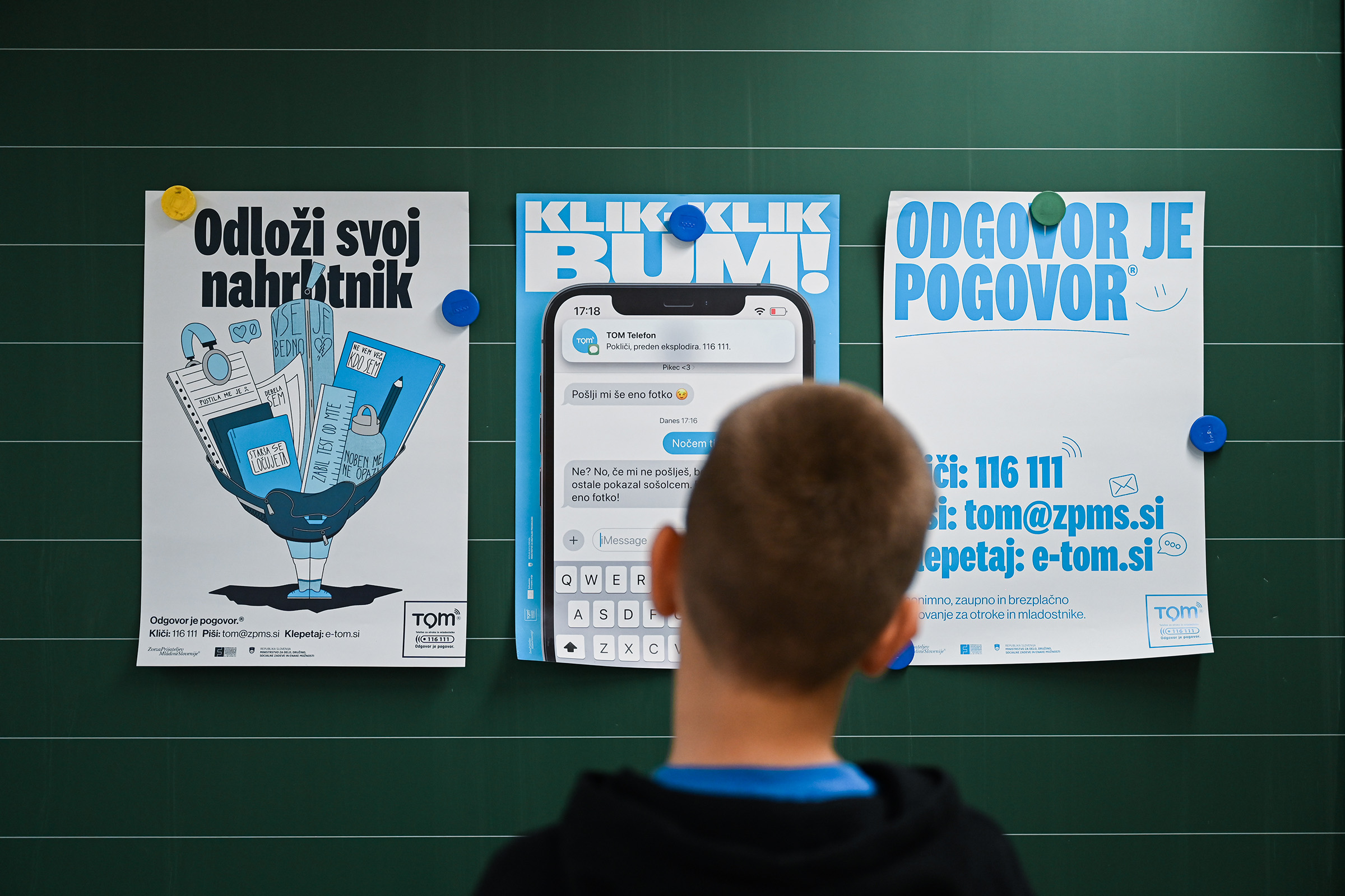
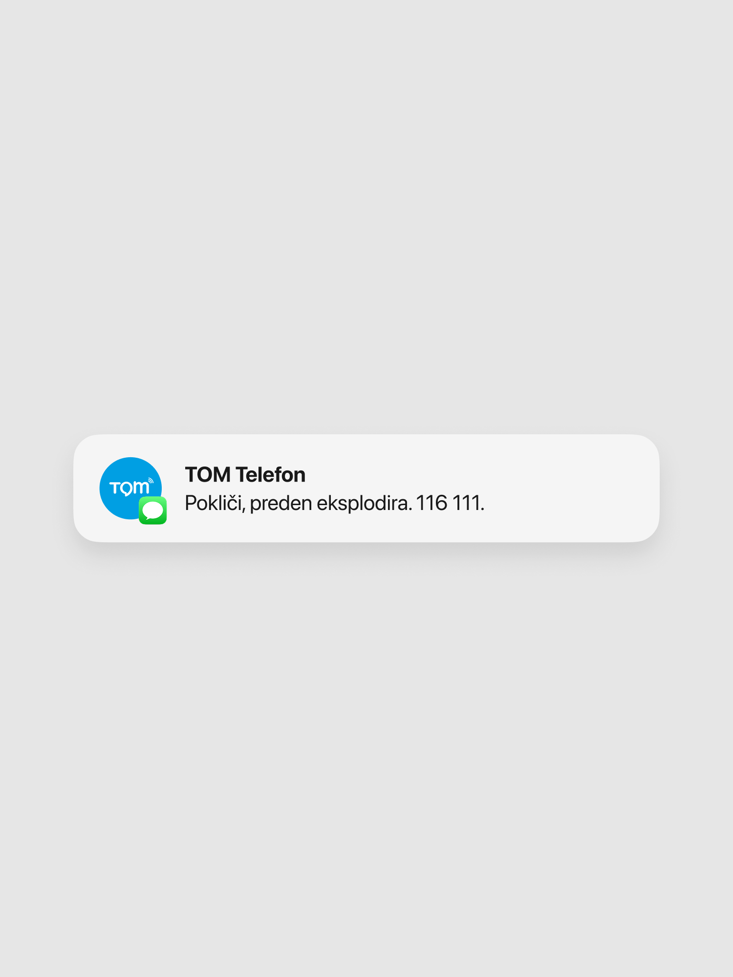
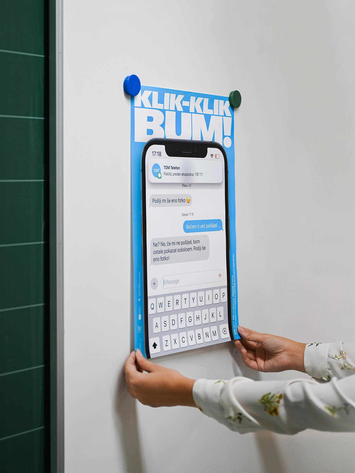
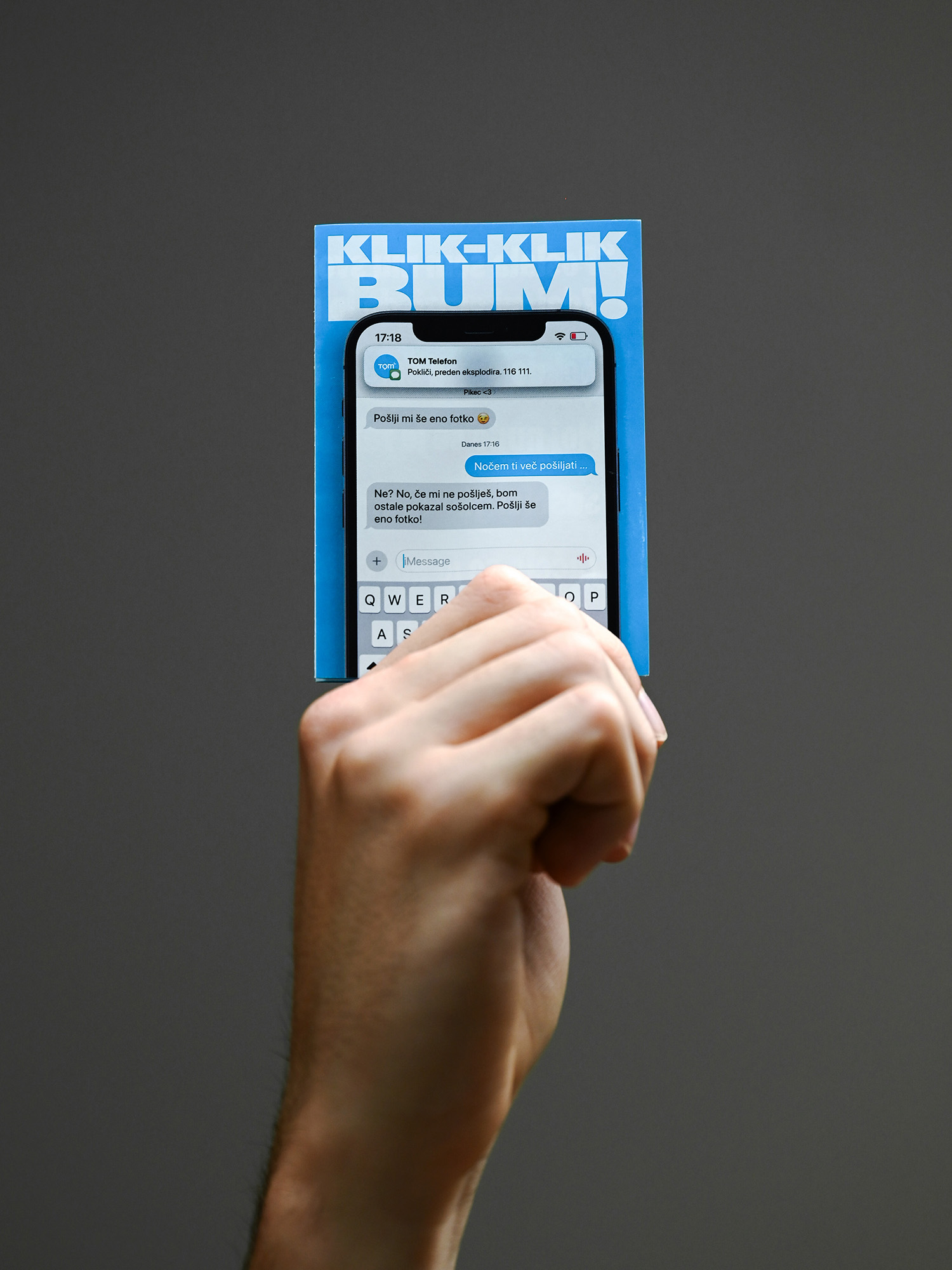
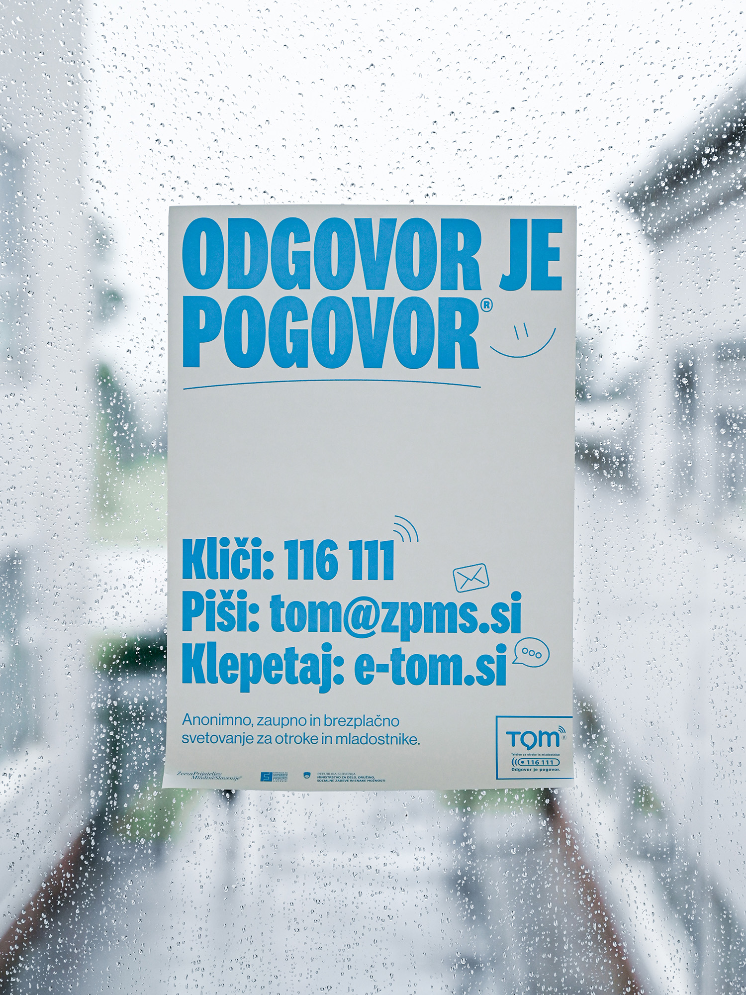
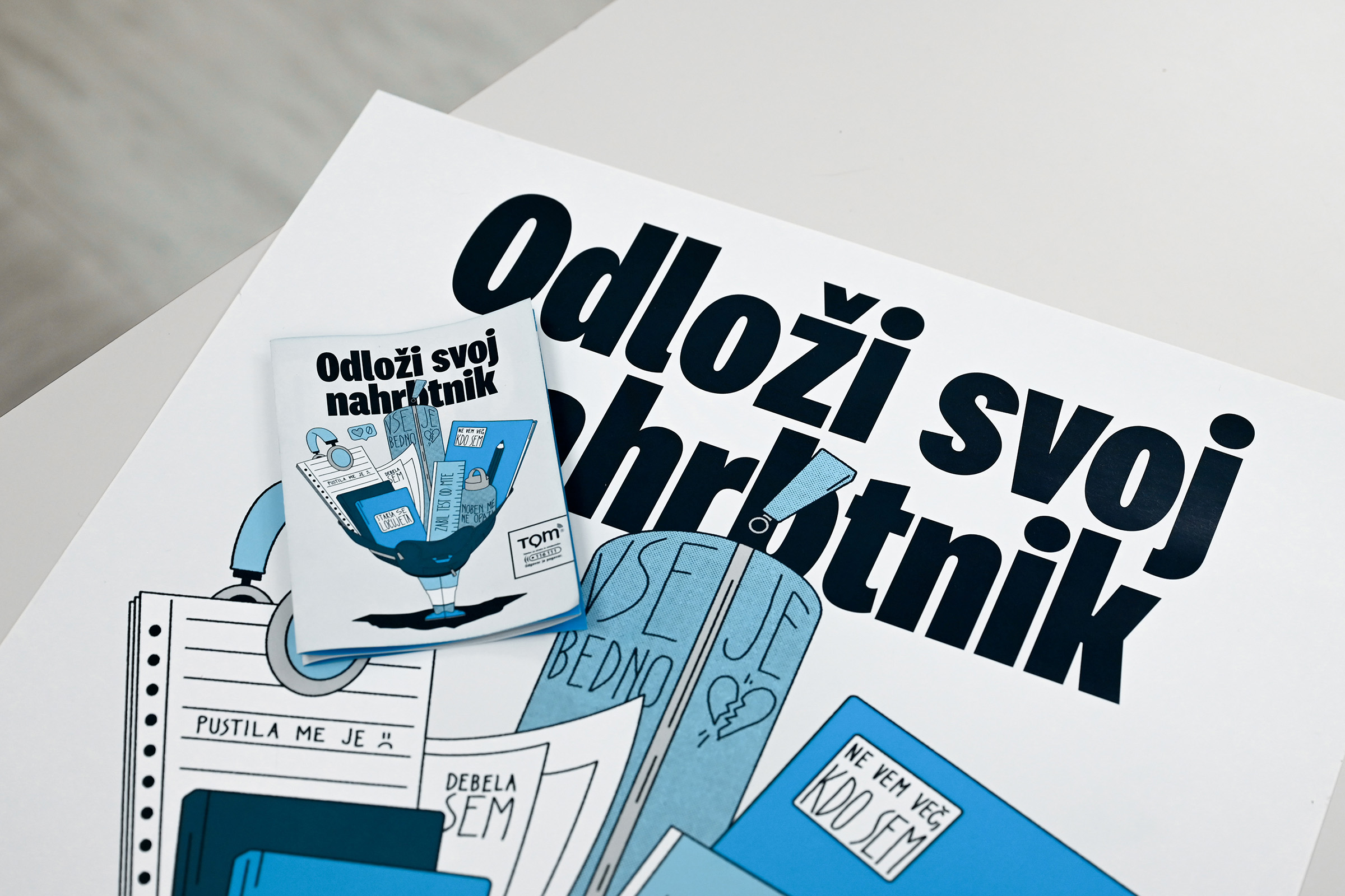
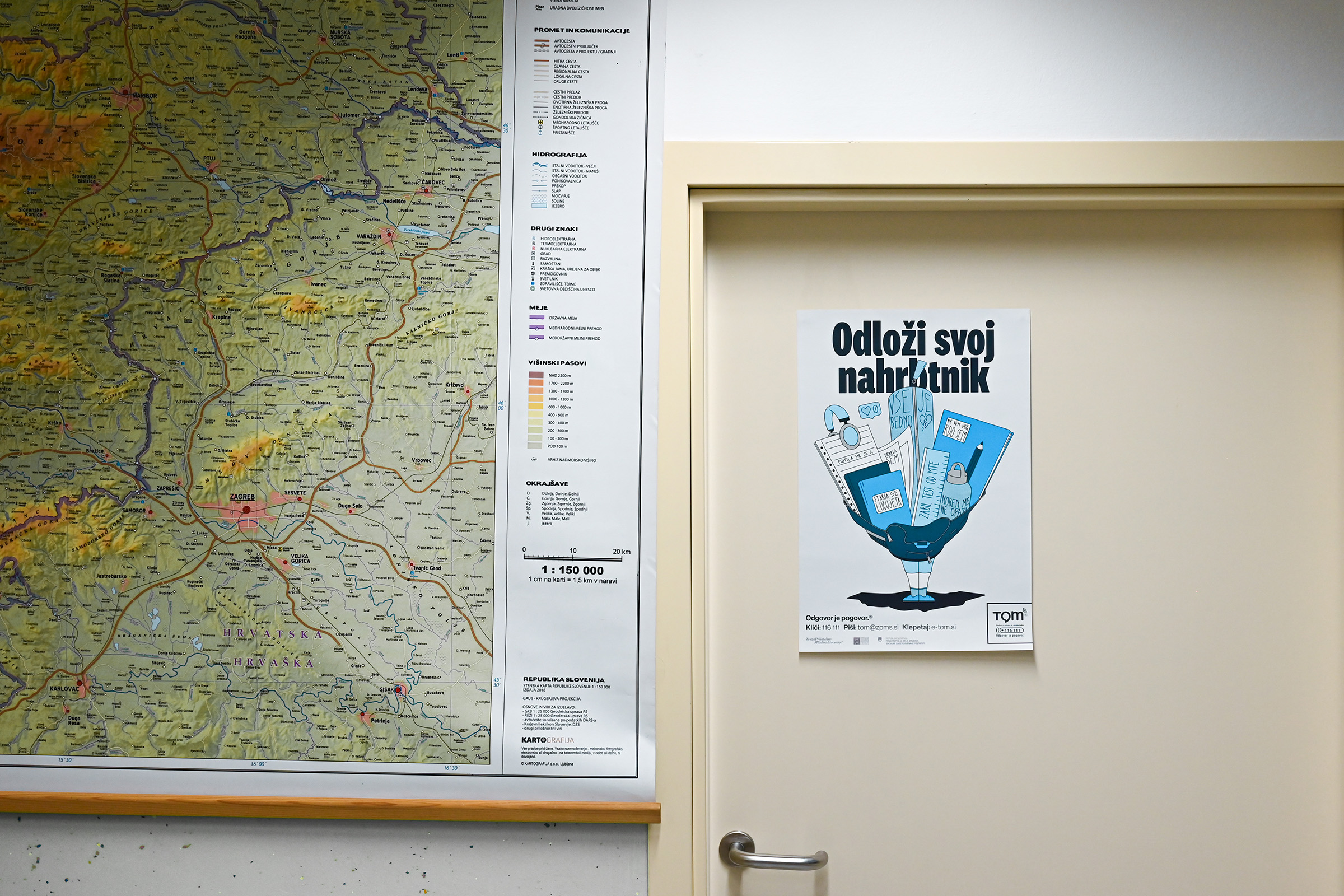
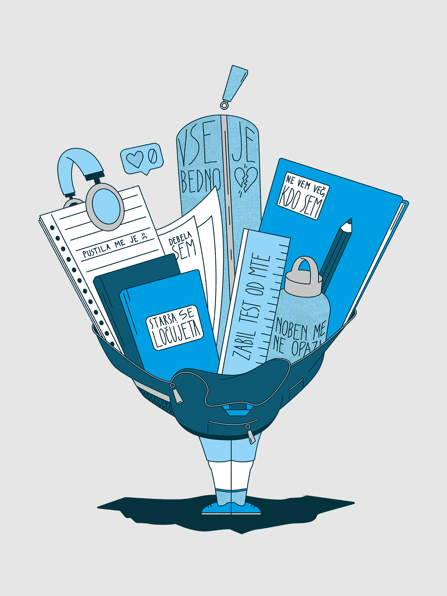
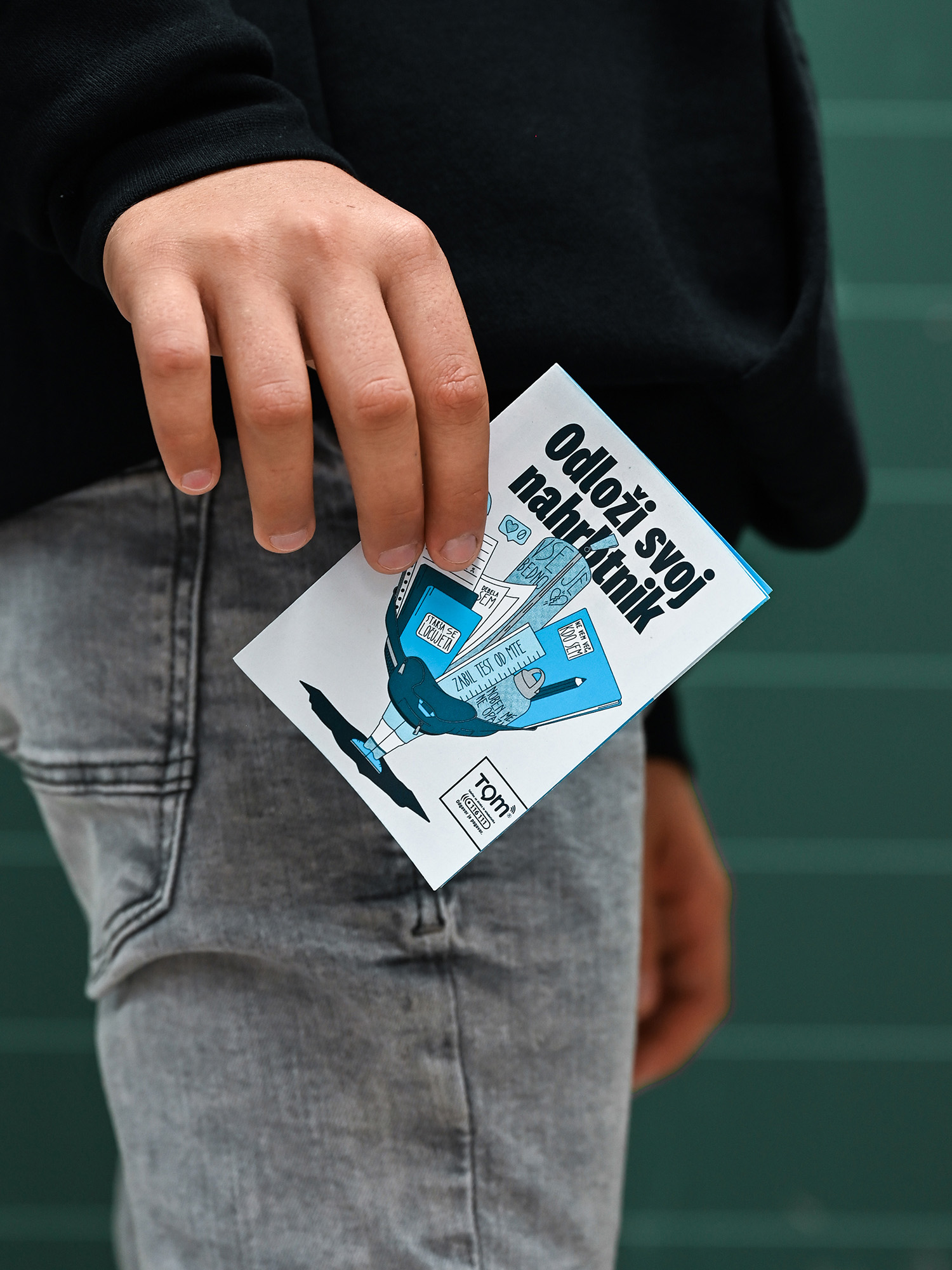
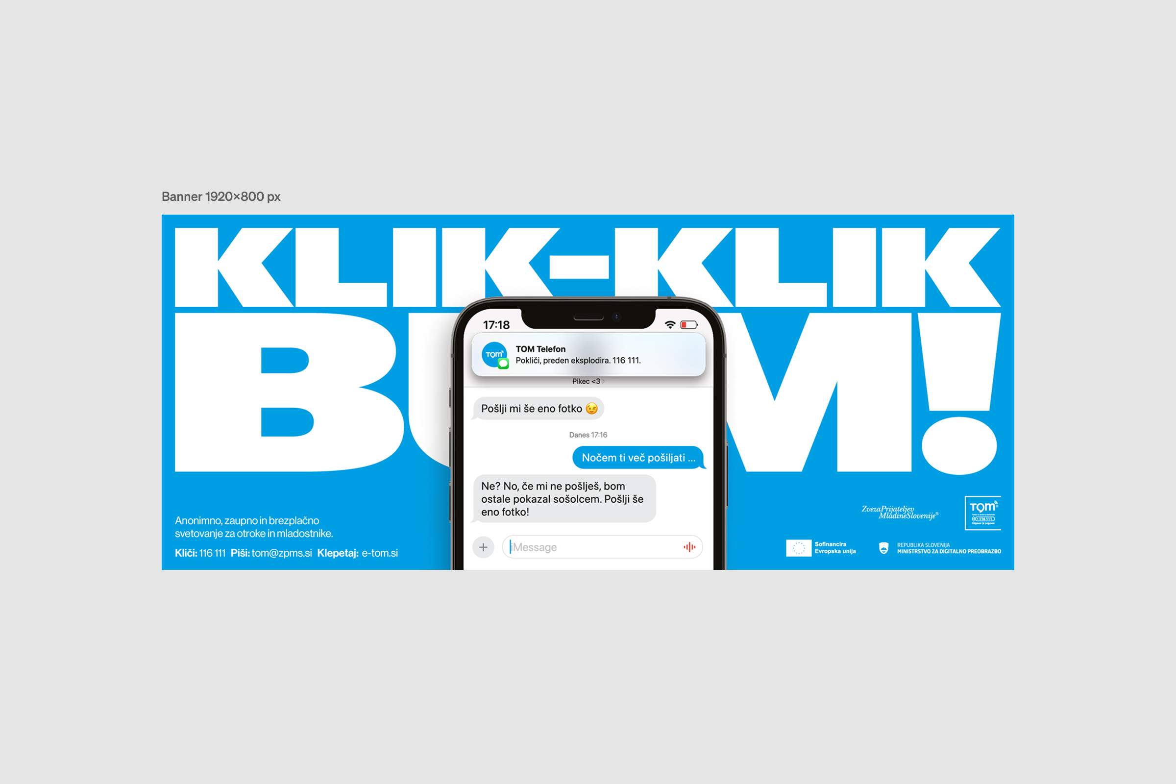
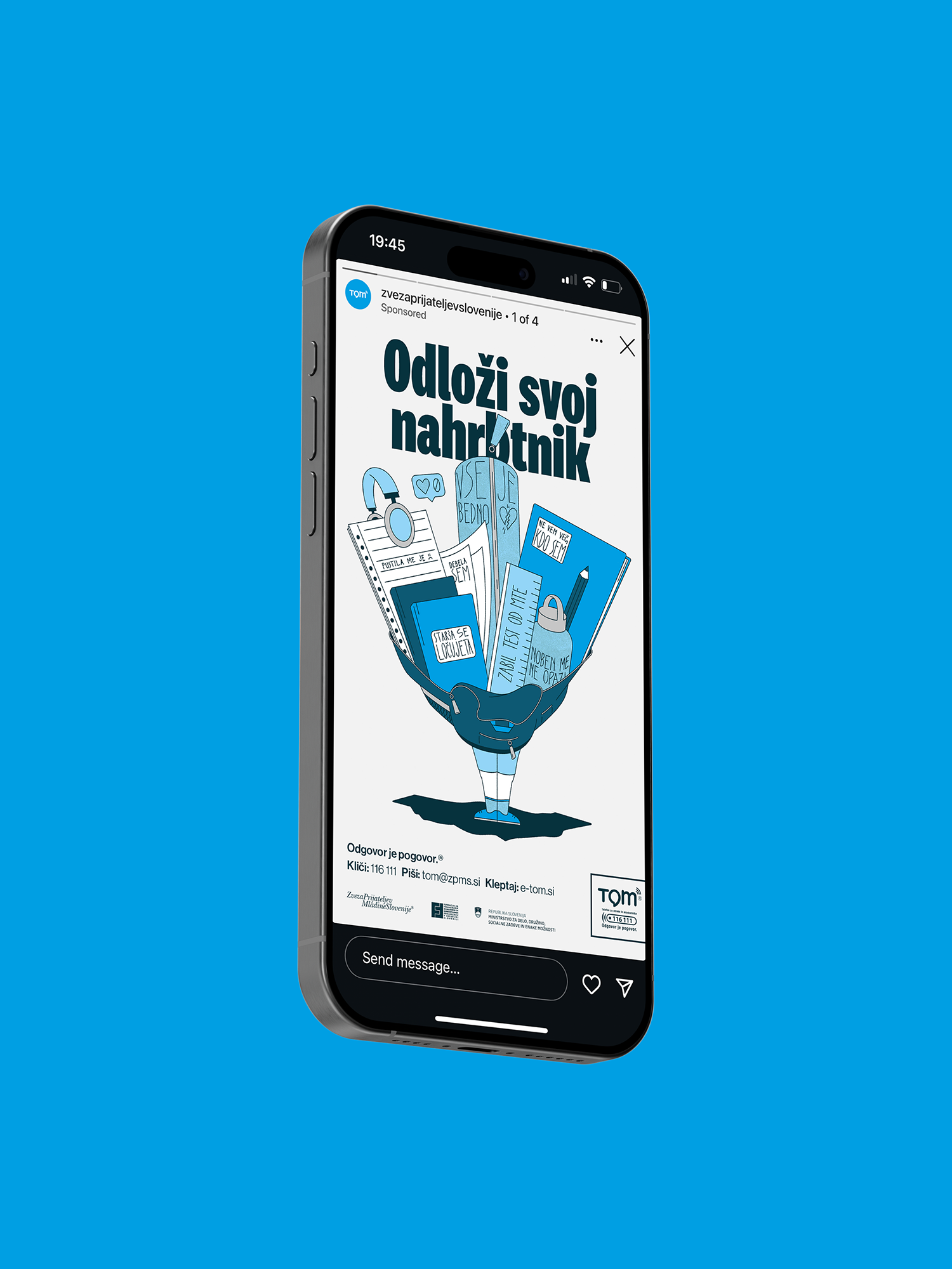
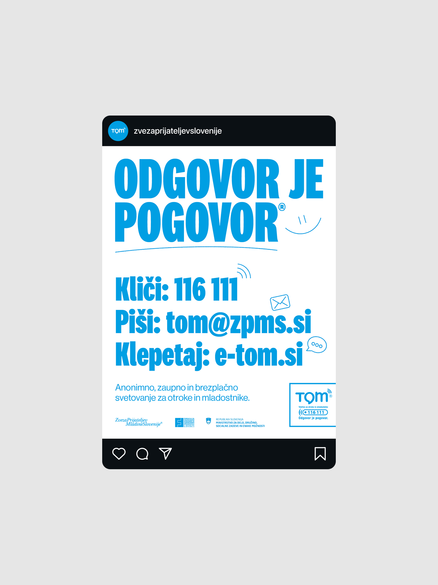
The campaign resulted in a coherent visual and narrative system that connected all materials under one recognizable identity. The three core posters formed the backbone of the concept. The informational poster communicated TOM’s values such as simplicity, trust, and warmth. They were expressed through soft, bold typography, TOM’s signature blue color, and notebook-like hand-drawn illustrations that reflected familiarity and approachability. The creative TOM poster carried the message “Odloži svoj nahrbtnik” (“Put down your schoolbag”), visualizing the emotional weight many young people carry — from bullying and heartbreak to family struggles — and positioning TOM as the helping hand ready to listen. The internet safety poster, made for CVI (Center za varnost na internetu), focused on the topic of sextortion. A smartphone served as the central element, visualizing how quickly a seemingly harmless interaction can turn dangerous. The striking typography “Tic, tic, BOOM” underlined the sense of urgency and immediacy, while the message pointed directly to TOM as the lifeline for anyone caught in such a situation. To ensure coherence across all materials, we connected the two TOM helpline posters with a unified logo lockup, and used the signature TOM blue throughout the entire campaign. That tied all print and digital formats together into one recognizable, consistent story. This way, each piece could stand on its own, yet when viewed together, they formed a complete ecosystem of trust, awareness, and support.
Photos by Tia Skok, Typography by Klim and ABC Dinamo


